This is a guest blog from Louise Horner, Digital Communications Manager at Target Ovarian Cancer.
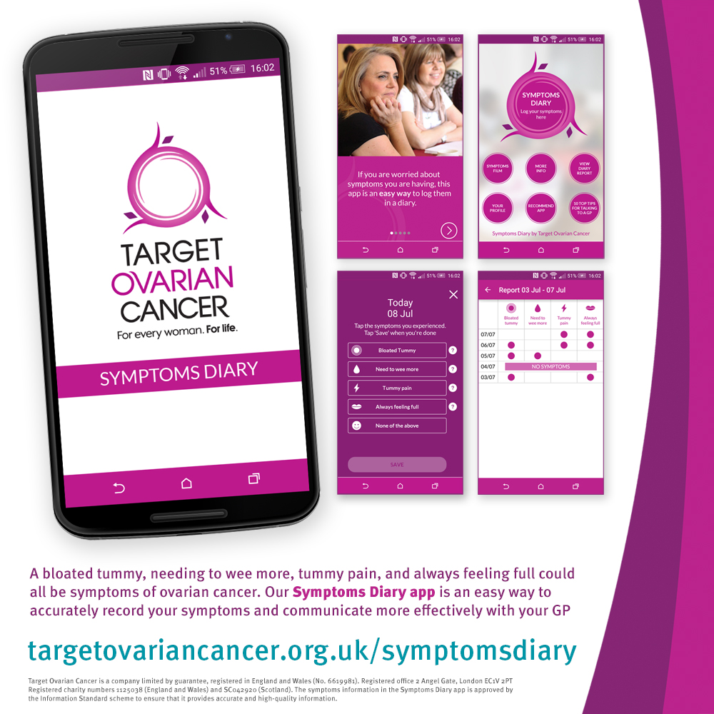
 This July, Target Ovarian Cancer launched their first ever mobile app – The Symptoms Diary – to help women who are worried about ovarian cancer record their symptoms and talk to their GP. Improving early diagnosis is a core aim for the charity, as it has a proven effect on survival. Three quarters of women with ovarian cancer are diagnosed once cancer has already spread, and if diagnosed at the earliest stage, up to 90 per cent of women would survive five years or more – significantly more than the current 43 per cent.
Target Ovarian Cancer has long urged concerned women to keep a symptoms diary, and we recognised a need for a digital solution that would be straightforward, easy to use, and would encourage women to record their symptoms accurately and regularly.
Thankfully the development process was pretty straightforward. Here are some tips we can impart on how best to make the process work:
Use focus groups/expert panels to ensure the need is there and the solution is the right one
We are fortunate to have an expert GP Advisory Board to advise us on any of our GP related content, so we had clear guidance on what the app needed to achieve from the outset. We also involved women with ovarian cancer heavily throughout the entire process. This refined the format and the usability of the app a lot before we even started working with our agency. A simple but important step.
Have a clear idea of what you want from an app
Dr Sharon Tate, our Head of Primary Care Development, lead on the app development. Her experience with GPs, and women with ovarian cancer, how they communicate with each other and the gap in communication meant that she keenly understood exactly what the app needed to do. She was therefore able to write a pitch proposal to agencies that pinpointed what was needed from the app – without being too prescriptive about the functionality, which was left to the digital experts.
Get an agency who really get you
We worked with BrandWave, an agency who previously worked on our award-shortlisted website (launched in 2014). This isn’t a prerequisite, obviously, as you won’t always have a previously used agency to contact, but even after a pitch process, it was BrandWave who truly understood us as a charity, as a brand and in terms of what we wanted the app to achieve.
Have a preliminary ‘what if?’ meeting
We came up with many, many questions that we needed to answer during the project at a preliminary meeting where we threw ideas at each other: ‘What if someone records their symptoms for 3 weeks then stops?’ ‘What if they record [n] instances of one symptom but none of the others?’. These questions needed to be posed earlier enough into the project that they didn’t cause delays or additional cost later on.
Sort out your disclaimers/legal advice
This is maybe not relevant for some apps, but given that ours is a medical app, it’s very important to consider early on the disclaimers or legal notices that the app needs to make it viable. The information provided in our app matches our existing information in other formats, which is peer reviewed and reflects national NICE guidelines available for diagnosing ovarian cancer, but since that format of it is different, and because its interactive functionality provides an entirely different user relationship the role it plays needed to be entirely clear. This can take a while!
Apple and Android apps work quite differently and so do their app stores
Thankfully, we had this knowledge through our agency, but as it was our first app development, these were learnings for us. We developed our Apple app first, then Android, as it’s much easier to get an app approved on the Google Play Store than on the Apple App Store (which takes over a week). Once the Apple version was developed we worked on the Android version. This required quite a few tweaks to get it to look how we wanted – and interestingly there are some elements of styling that simply do not carry over from one to the other.
Provide an offline version if possible
We’ve had a fantastic response to our app, with more downloads than we were expecting. But far more than this, the publicising of the app has actually publicised the print version of the Symptoms Diary far more. We’re really pleased we provided both, as it means we’re not excluding those people who’d rather carry a handy bit of paper around with them instead.
Find out more:
The app is free to download and is available for iPhone and android. The Symptoms Diary app is also available in a printed version. The symptoms of ovarian cancer are feeling bloated, abdominal pain, feeling full and needing to wee urgently. If any readers have been experiencing these symptoms 12 times or more in the last month, then they should go straight to their GP.
http://www.targetovariancancer.org.uk/symptomsdiary
